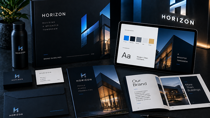
The challenge
A logo isn't a brand.
A business can have a perfectly decent logo and still look completely different every time somebody opens a presentation, posts on social media, sends a proposal or launches a campaign.
Different colours. Different fonts. Different imagery. Different tone.
Eventually, everything starts to feel disconnected.
The objective was to create a complete visual identity with clear rules behind it, giving the business a recognisable look and the tools to protect that identity as it grows.
Our approach
We started by looking beyond the logo.
What should the business feel like? Who does it need to appeal to? What should somebody think when they see the brand for the first time? And most importantly, how do we make that feeling consistent everywhere the business appears?
From there, we developed a complete visual language around the brand. Logo usage. Colour. Typography. Photography. Graphic elements. Layout. Digital applications. Print applications.
Everything was designed to work together as one recognisable system rather than a collection of individual assets.
The identity was designed to work just as effectively on a tiny mobile screen as it does across a presentation, website, social campaign or printed document.
Every element has a purpose. The primary colours create recognition. Secondary colours provide flexibility. Typography creates hierarchy. Imagery establishes atmosphere. Graphic elements give the brand its own visual fingerprint.
And the guidelines pull everything together so whoever touches the brand knows exactly how it should look and feel.
The final guidelines become the rulebook for the identity. They define how the brand should be presented across different environments while still leaving enough flexibility for creative work.
The document covers areas such as: Logo Usage, Colour, Typography, Imagery, Layout, Graphic Elements, Digital Applications and Print Applications.
Instead of somebody opening a blank document and guessing what shade of blue to use, which font looks about right or where the logo should sit, there's now a clear system to follow.
What we delivered
- Brand Strategy & Creative Direction
- Primary Logo Design
- Secondary Logo Variations
- Brand Mark / Icon
- Colour Palette
- Typography System
- Logo Usage Guidelines
- Spacing & Sizing Rules
- Photography & Image Direction
- Graphic Elements
- Digital Brand Applications
- Social Media Direction
- Business & Marketing Collateral
- Brand Guidelines Document
The result
The finished identity gives the business something much more valuable than a new logo. Consistency.
From the website and social media to proposals, presentations and marketing campaigns, every touchpoint can now feel like it came from the same company.
The brand becomes easier to recognise. Easier to manage. Easier to scale. And far harder to dilute.
Built for more than launch day
A good identity shouldn't trap a business inside a rigid box. It should give the company enough structure to remain recognisable while leaving enough room to evolve.
That's why the system was designed with future applications in mind, allowing new campaigns, services, content and creative assets to be developed without slowly pulling the brand apart.
One identity. A thousand possible applications.
Want a brand identity that holds together everywhere it appears?
Start a projectLet's build something that grows.
Tell us about your business, your problem or your idea. We'll work out the smartest way to get you there.